Megan is an illustrator based in Leeds, UK.
Eyup Megan. Can you tell us a little bit about your tape and your song selections?
Hey Sam!
My idea for this mixtape is based around the concept of the ultimate “girlboss” (GIRLBO$$, if you will). She is motivated, always winning, and always gets what she wants...
I wanted to use the pop genre to parody the girlboss and what it has become. Initially, the term was popularised by Sophia Amoruso (the founder of Nasty Gal) in 2014, and was a word used to describe a woman who was successful in a male dominated setting, like the business world. More recently, the internet has taken a bit of a dislike for the term, and it is now usually used in an ironic way. To me a girlboss is someone who on the outside looks confident, driven and focused, but in reality, has a lot of flaws, such as being materialistic and self-obsessed.
The songs I selected for this tape are that type of hyper-pop or bubblegum-pop that can be quite bombastic, confident, sometimes sickly sweet or even sound ridiculous, to reflect the attitudes of the girlboss in 2022. Most of the songs came before the concept, but a lot of the lyrics and beats can come across as tongue-in-cheek and I don’t think they are to be taken seriously, so I wanted to play on the exaggeration found within them.
If you want to feel like a girlboss, grab a pair of sunglasses (and a feather boa if you have one) and give this playlist a listen. It’s surprisingly effective!
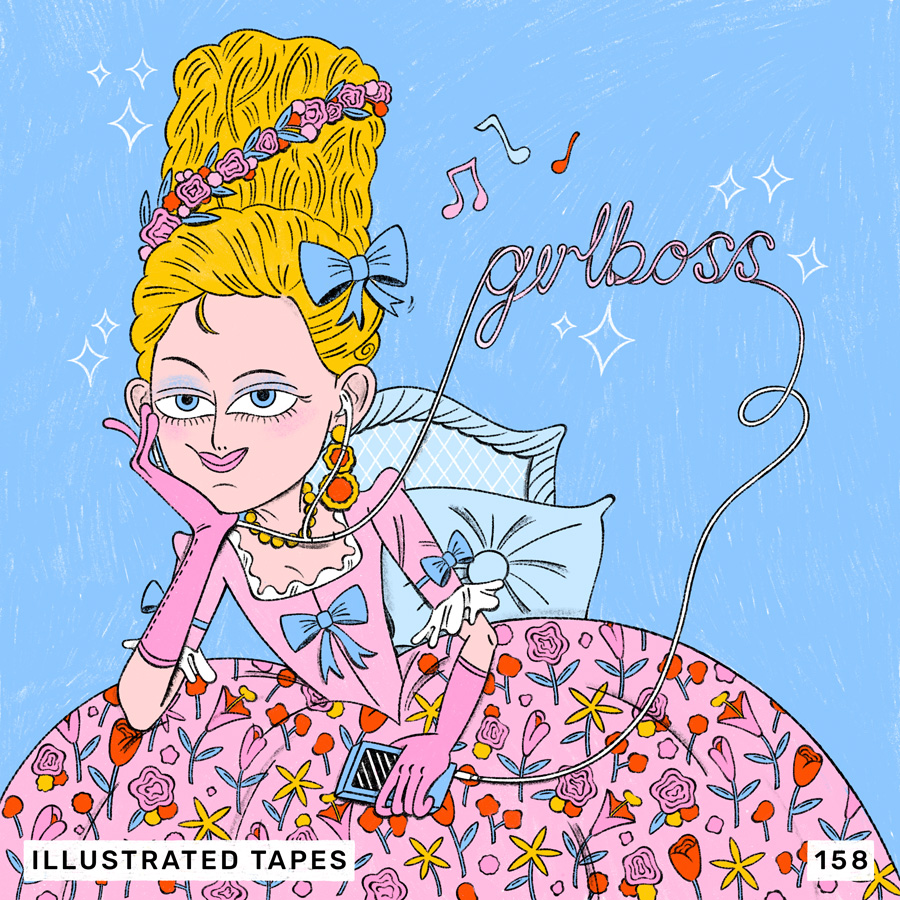
What direction did you take with your cover art, and what was your process?
It took a lot of drawing for me to settle on this final image. I knew I wanted the focus to be a character (the girlboss), so I tried a glittery, 2000s aesthetic at first, which to me feels like how hyper-pop music sounds, though it felt a little on the nose. I was playing with the idea of hyper femininity; big hair, big dresses, and pastel colour palettes, which led me to Marie Antoinette. It’s pretty funny (or maybe just stupid) to imagine her as the ultimate girlboss of her time. She had a high position of power, known for her lavish spending and (similarly to the girlboss) she became more and more unpopular with the public. I was partly inspired by Sophia Coppola’s reimagining of Marie Antoinette; less realistic and more fantastical as she has that essence of the 2000s.
In terms of process, I used Procreate and tried out some new brushes, as I am always looking to add some texture to my work!
What are your fave album covers, records with a great music and artwork combo, or musical projects with a visual component?
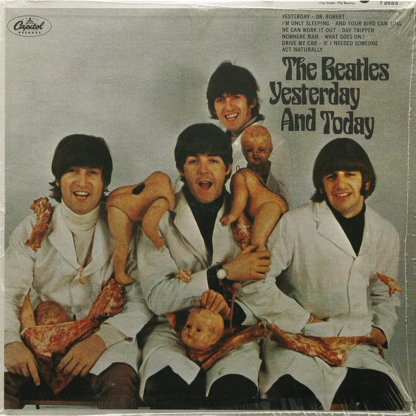
Yesterday and Today – The Beatles
1966, Captiol
Artwork: Robert Whitaker
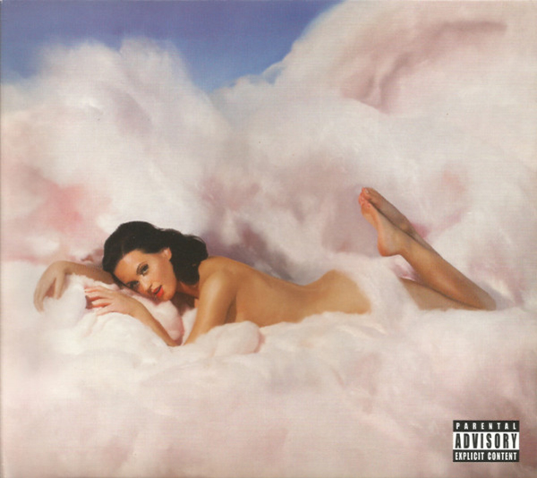
Teenage Dream – Katy Perry
2010, Capitol
Artwork: Will Cotton
This cover blew my eleven-year-old mind, especially when I found out it was an oil painting and not a photograph. I think it works so well because it is simple, provocative but also really camp, exactly like the album itself. The colours are so soft and the clouds look yummy. It defines the pop aesthetic of the 2010s to me.
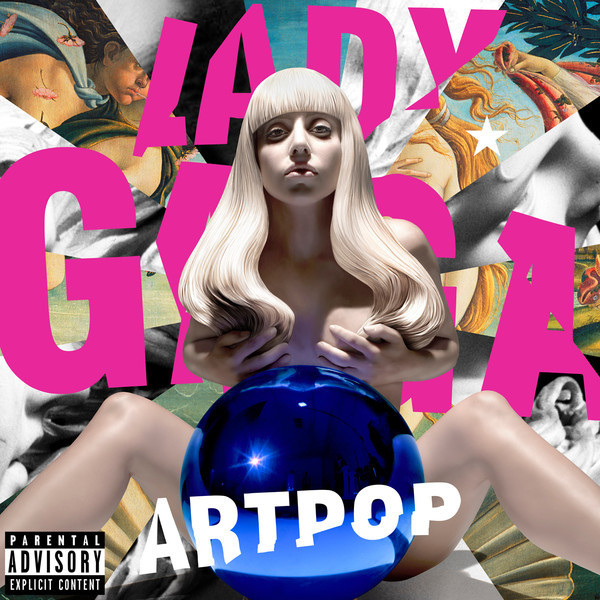
ARTPOP – Lady Gaga
2013, Streamline / Interscope
Artwork: Jeff Koons
What did you listen to growing up?
I grew up just around the time that Disney Channel was becoming huge, so of course I was listening to Miley Cyrus (admittedly it was more Hannah Montana), Selena Gomez and the High School Musical soundtracks. I’ve always been into pop, whether I wanted to accept that as a teenager or not, as it sometimes feels a bit uncool to be a fan of mainstream pop music. I eventually moved on to artists like Katy Perry and Lady Gaga.
My music taste was also influenced by what my parents would listen to in the car, so add The Beatles, the Bee Gees and Rod Stewart to the list.
And what’s on heavy rotation for you at the moment?
When I listen to music I often go through phases of certain genres or a particular decade. At the moment I’m currently stuck in the late 60s and early 70s. Just recently I was listening to Pet Sounds by The Beach Boys and RAM by Paul McCartney for a good while. Now I’m going through Paul McCartney and Wings’ discography.
What’s happening in your creative world at the moment?
I recently had some time away from illustration, so I’m just getting back into drawing. I’m working on updating my portfolio and getting myself out there; I plan on selling some prints in the near future, which is pretty exciting!
Where can we find you?
www.megannottingham.com or on Instagram @megan.nottingham :-)
Thanks Megan 👋🏽