PK is a musician/composer, illustrator, collaboration facilitator, and all-around art weirdo. They’re based in Baltimore, Maryland, USA (occupied Piscataway land).
Hey PK! Can you tell us a little bit about your tape and your song selections?
You are floating through the depths of an endless vast expanse. You are equally in awe of its beauty and its terrifying breadth. As you descend, you slowly approach an impressive massive form too large to comprehend - itself an entire world. Do you seek to fight it? Inhabit its surface peacefully? Have an otherworldly love affair with it?
On this playlist you’ll find a lot of spacey instrumental psych, funk, jazz fusion, library and early synth stuff from the late 60s to the early 80s (+ one SNES song from ‘95) to guide you on your journey. Without a plan, to start my playlist I threw a bunch of songs I was listening to in a big pile. Listening to them together kept evoking mental images of floating down slowly towards an incomprehensible planet-sized colossus covered in small lights. So, here we are.
I listen to a lot of instrumental music and really appreciate the way one song can tell so many different stories based on the listener and the context. So I thought I would take a bunch of separate sort of tonally adjacent songs and try to give them all a shared context and narrative, even if it’s nowhere near the original intent of the song.
What direction did you take with your cover art, and what was your process?
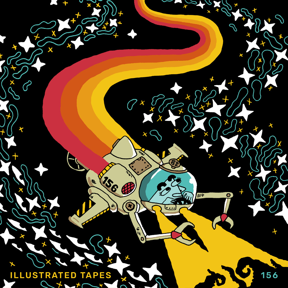
I realized I painted myself into a corner by making the playlist first and coming up with an intentionally ambiguous and vague theme, so I struggled for a bit with depicting the general aesthetic idea without getting too specific. I wanted it to be ambiguous where the scene was taking place (underwater, outerspace, cellular level, etc) I knew I wanted a vessel modeled after 70s sci fi descending into an infinite abyss (which is the overall aeshetic I was going for with the playlist as well). I originally spent a whole buncha time on a first version that I ended up completely scrapping because it felt more creepy than mysterious.
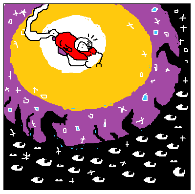
(very loose MS Paint thumbnail of original concept)
The final cover really came into existence when I decided to lean harder into 70s design elements - specifically the colored stripe trail. I also had to actually learn how to draw sci fi vehicles, which is a thing I’ve always wanted to draw but… have never been able to wrap my head around. Oops! So I stared for a long time at some reference images of vessels with dome-esque cockpits – photos of actual submersibles as well as some 90s anime spacecrafts. The box art to the original console version of Twinbee was the real moment it clicked though - it has a lot of the essential elements in a simplified form. That was my biggest frame of reference, really.


I used to be really obsessed with old Blue Note album covers (the ones by designer Reid Miles and photographer Francis Wolff). They all have such a clean, cohesive look across the entire catalog. Like, they demonstrate how important simplicity is when it comes to design. The right mix of photo, typeface, cropping and color is all you need sometimes. One of my favorite album covers (and albums) of all time is Cornbread by Lee Morgan.

Cornbread – Lee Morgan
1967, Blue Note
Design: Reid Miles
Photography: Francis Wolff
I also like designs that are very sparse and simple with simple cohesive color schemes. A great example would be Ege Bamyasi by Can. But I also like a good complex cluttered mess full of tiny details too, like a lot of Jason Galea’s covers for King Gizzard.

Ege Bamyasi – Can
1972, United Artists Records
Art Dir: Ingo Trauer, Richard J. Rudow
I just really appreciate any band/artist that gives each of their albums its own distinct identity, with the artwork being integral to that identity. They Might Be Giants are really good at that, it probably helps that one of their members is a graphic designer.
Ah! I don’t know! I could sit here all day talking about album art. I even made a whole mini zine of album cover fanart and keep saying I’m gonna do a vol 2. I really feel like visual aspects can’t be separated from modern pop music, I feel like there’s some artists I wouldn’t have even gotten into if I wasn’t also hooked by their album covers, music videos, visual aesthetics, and gimmickery.
What did you listen to growing up?
My parents had this great 60s Motown boxset when I was a kid, I think that was really important to my musical development. I also got a lot of jazz from my dad, hip-hop from my brother, and I also listened to a lot of music in video games very intentionally. In middle school I pretended I was into metal? And in highschool I listened to a lot of ska, 70s prog and glam rock because I was a little queer weirdo who refused to listen to popular new stuff because I was “a non-conformist” haaa. I was really into anything that could be considered a concept album - not just prog rock, but things like ELO and Parliament.
Then I had a mental health crisis, hated everything I used to be into and quickly got into punk and indie music. My music tastes have expanded a lot since then but lately I’ve found myself returning to prog and ska and gaining a new perspective and appreciation for it as an adult.
And what’s on heavy rotation for you at the moment?
I’ve obviously been listening to a lot of spacey 70s psych funk type stuff. But recently I needed to reset and clean out my brain from the depths, so lately I’ve been listening to more poppy stuff. Orange Juice, Fleetwood Mac, Sheryl Crow, YMO’s Naughty Boys, Tierra Whack, T. Rex. And a lot of Hailu Mergia during bike rides. Me and my partner got really into Shaggy for a hot second recently also??
What’s happening in your creative world at the moment?
Oh gosh too much stuff for me to handle and it’s all my fault haha. I’m finishing up my first full-length album for my instrumental solo project FrogSmog. I’ve been working on this album (called PRINCESS) for about 7 years now and it’s finally in the end stages so hopefully that should be released soon! If you like this playlist, you might like the new stuff I’ve been working on for FrogSmog so keep an ear out!
I’m also organizing a weird benefit compilation called PINCH where every track will be a minute long. That should be coming out in the summer. Feel free to e-mail me if you’re interested in participating! All sales will be going to an awesome important local trans-led organization called Baltimore Safe Haven.
As for visual art, I’ve just been trying to push myself out of my usual comfort zones and mediums because I’ve been feeling really burnt out by them. I’m also organizing a giant weird collaborative comic but that’s all I can say about it right now but I assure you it’s great.
I’ve also been learning how to yo-yo and also recently started an old-school phpbb forum??? Look guys... my interests and goals have quickly been getting more and more esoteric with every year and I’m just trying to keep up with my brain haha.
Where can we find you?
My website with links to all my stuff: uhpk.kim
My instagram where I post new illustrations: instagram.com/uhpkkim
And here’s all my music projects:
frogsmog.bandcamp.com
pkplus.bandcamp.com
slamandwallace.bandcamp.com
Thank you PK! 👋🏽