Nay is an illustator and sometimes animator based in Bristol, UK.
* * *
Hey Nay. Can you tell us a little bit about your tape and your song selections?
Hey! This has been my first year as a freelancer and my playlist is kind of a bye-bye to the 9–5. The songs are a mish-mash of synth-pop/rock, sad girls and bedroom boys representing the various phases of dread and pure happiness I’ve been through. The cover is a bit of a mini comic and it kind of represents walking off into the sunset (which to be honest I haven’t) but I am ten times happier.
What direction did you take with your cover art, and what was your process?
I was drawing lonely boys in swivel chairs, characters opening doors to the outside world, a retro computer with a pixelated middle finger on the screen... I love sexy 80s office photographs with strange mood lighting and they definitely inspired me to be a bit weirder with my sketches. This instagram account I follow is amazing. In the end I decided to make it sequential. I picked out all the ideas I was vibing with in my previous sketches and made them into a little story.
What are your fave album covers, records with a great music and artwork combo, or musical projects with a visual component?

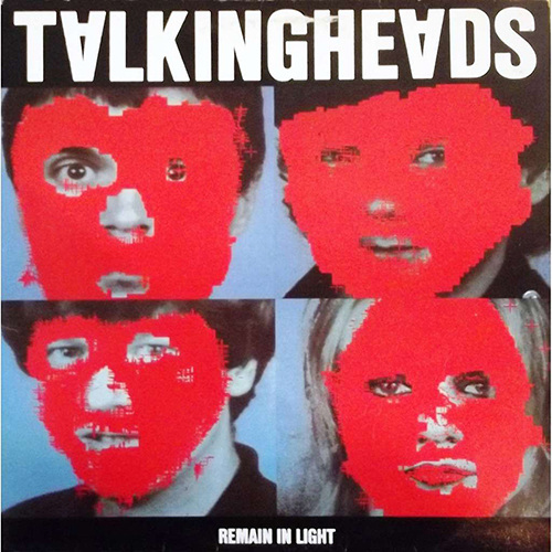
Remain In Light – Talking Heads
Concept: Tina Weymouth and Chris Frantz
Design Direction: Tibor Kalman, M&Co
Computer images: HCL, JPT, DDD, Walter GP, Paul, C/T
I like that it’s all about a stripping of identity and I definitely took inspiration from the four way grid for my own cover. Did you know this was one of the first album covers to be designed on a computer? Speaking more of Talking heads this video is a real favvy of mine.

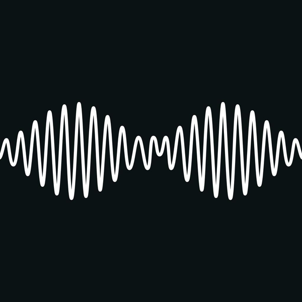
AM – Arctic Monkeys
2013, Domino
Artwork: Alex Turner, Matthew Cooper
![]()
2013, Domino
Artwork: Alex Turner, Matthew Cooper
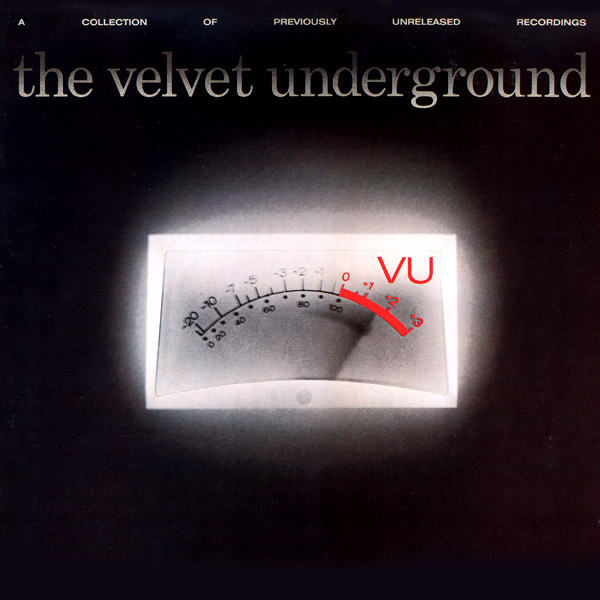
I’m completely in love with AM. It’s an acronym of the Arctic Monkeys name but also an acronym of amplitude modulation which is the name of the wave pattern on the cover. I didn’t realise before but the album name takes inspiration from The Velvet Underground, another all time favourite band of mine and their album VU. It has an image of an amplifier VU meter on the cover. My mind has been blown ever since I found out about it.

VU – The Velvet Underground
1984, Verve Records
Design: Larry Kazal
Photography: Tobi Seftel
1984, Verve Records
Design: Larry Kazal
Photography: Tobi Seftel
Honourable mention:

Lush – Snail Mail
2018, Matador
Design: Mike Zimmerman
Photography: Michael Lavine
2018, Matador
Design: Mike Zimmerman
Photography: Michael Lavine
My parents introduced me to Duran Duran, David Bowie and 80s rock. My mum is a pianist and plays all day everyday and is a classical music buff. But my music really started to change when my Dad bought me a Zutons CD for my birthday one year haha. Who killed The Zutons just played on repeat on my CD player. After that I branched into more indie rock like The Libertines, Arctic Monkeys and then I fell deep into my emo phase. I kind of came back full circle to the 80s when I overheard my brother playing The Smiths in his bedroom one time.
And what’s on heavy rotation for you at the moment?
Everything ShitKid has released recently I just play over and over.
What’s happening in your creative world at the moment?
I’ve just finished a bunch of work!
Now I have some time for personal work, more prints, animations and possibly some 3D wares so stay tuned :).
I also have a throw coming out with Slowdown studio this year which I am so excited about.
I’ve just finished a bunch of work!
Now I have some time for personal work, more prints, animations and possibly some 3D wares so stay tuned :).
I also have a throw coming out with Slowdown studio this year which I am so excited about.
Where can we find you?
Website - www.naygroves.com
Instagram - @naygroves
Etsy - NayGrovesDesign
Thanks Nay 👋🏽
Website - www.naygroves.com
Instagram - @naygroves
Etsy - NayGrovesDesign
Thanks Nay 👋🏽